When most people think of McLaren, they picture sleek supercars, Formula 1 dominance, and cutting-edge engineering. But beyond the roar of the engines and the precision of the aerodynamics, one small yet powerful detail has represented the brand through decades of innovation: the McLaren logo.
As someone who works with these machines daily, I can tell you that the emblem on the nose of a McLaren isn’t just decoration—it’s a piece of history that reflects how the brand itself has evolved.
Let’s take a journey through the evolution of the McLaren logo, from its racing roots to the modern symbol we see today.
The 1960s: The Kiwi Era
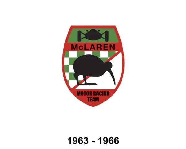
In the early years, Bruce McLaren, the New Zealand-born founder, wanted a logo that reflected his heritage. The very first McLaren logo featured a kiwi bird, a proud nod to his homeland.
- Simple, black-and-white design.
- Emphasized the team’s connection to Bruce’s origins rather than luxury branding.
- Used primarily in motorsport, representing grit and determination rather than polish.
As a mechanic, when I see vintage McLaren race cars come into the shop for restoration, that kiwi emblem instantly takes me back to the raw days of Formula 1 and Can-Am racing—when engineering was bold, risky, and experimental.
The 1970s: The Speedmark is Born

By the early 1970s, McLaren shifted away from the kiwi and introduced a chevron-style logo. This symbol looked like a speedmark—a design meant to capture motion, speed, and the forward-thinking nature of McLaren engineering.
- Introduced during the team’s first era of F1 dominance.
- Appeared in bright, eye-catching orange and red tones.
- Signaled the brand’s move from small independent racer to international powerhouse.
To us in the garage, this was McLaren finding its identity—not just a team from New Zealand anymore, but a global racing brand.
The 1980s–1990s: Modernization and Refinement
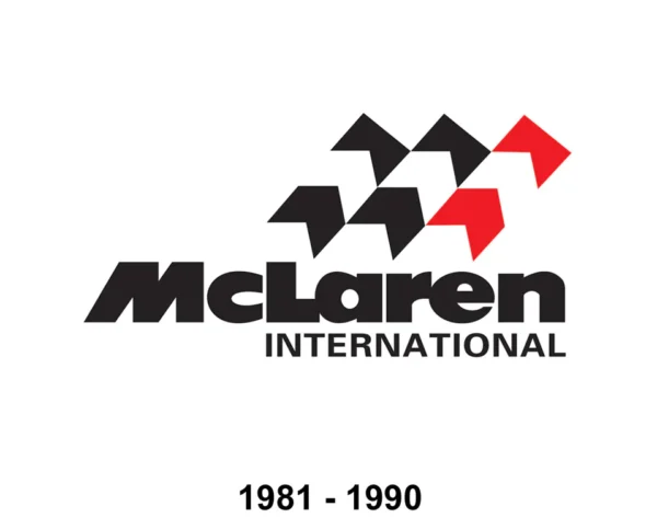
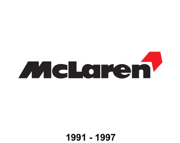
As Formula 1 became more commercialized and McLaren grew into a polished, world-class team, the logo was refined.
- The chevron evolved into a curved “swoosh”, resembling airflow or a bird’s wing.
- Typography was updated to a cleaner, more professional font.
- Used consistently across both race cars and McLaren’s emerging road car ventures.
This was the era of legends like Ayrton Senna and Alain Prost, and the logo mirrored the precision and sophistication of the cars they drove.
The 2000s: The Sleek Supercar Symbol
With the launch of the McLaren F1 and later the rebirth of McLaren Automotive, the logo evolved again into the more recognizable version we see today.
- The “speedmark” became sharper, more abstract, and often shown in red.
- The wordmark “McLaren” featured in bold, futuristic lettering.
- The emblem balanced heritage with modernity—perfect for a company that was now selling hypercars alongside racing.
Working under the hood of a McLaren F1 or MP4-12C, that little red swoosh feels like a signature—a reminder that this isn’t just another performance car. It’s something built with racing DNA.
Today: A Global Symbol of Innovation
The current McLaren logo still carries the speedmark, now instantly recognizable worldwide. Subtle refinements in shading, proportion, and typography have made it sleeker and more minimalist, but its essence remains the same:
- Speed, innovation, and motion.
- A direct link to motorsport heritage.
- A promise of engineering excellence.
For us mechanics, the badge isn’t just branding—it’s a seal of quality. Every time we torque down bolts, adjust suspension geometry, or fine-tune a turbo system, that logo on the car reminds us why McLaren engineering is held to the highest standard.
What the Logo Means to Those Who Work With It
From a mechanic’s perspective, the evolution of the McLaren logo isn’t just graphic design—it’s storytelling.
- The kiwi was about roots and humble beginnings.
- The chevron captured the raw speed of racing.
- The swoosh speedmark reflected the rise of technology and refinement.
- Today’s version represents global recognition and futuristic performance.
Each time I see it on a freshly finished McLaren supercar, I’m reminded that I’m not just working on a vehicle—I’m working on a piece of history that continues to move forward.
Final Thoughts
The McLaren logo has changed over the decades, but its core message has stayed the same: motion, progress, and excellence in engineering. For enthusiasts, it’s a badge of prestige. For owners, it’s a symbol of performance. And for those of us turning the wrenches, it’s a reminder of the legacy we’re trusted to maintain.
So the next time you see that little swoosh on the hood of a McLaren, remember—it’s more than a logo. It’s decades of racing victories, engineering breakthroughs, and the relentless pursuit of speed, distilled into one small symbol.
